Friday, December 10, 2010

Moleskine Sketches (found online)


While skimming online I found some of the most interesting photos people had posted of their sketches. Some were done by freelance artists, and others simply travelers and observers. At the moment I'm considering taking up more sketching again, and perhaps investing in a portable notebook to take around. Rather than try to set up projects, drawing from observation this semester brought back a lot of nostalgia for simple observational thinking (that I don't do enough of by far). Back home in Honolulu, I'd used to take a camera and ribbons out on the weekends and tie blue ribbons around the abandoned factory sights or small diners i'd come across while biking. Perhaps in the interest of getting the feeling of simple exploration back, it'd be fun to pack up when summer hits and take a singles roadtrip down route 66 to do some sketching.

Parallels of art and architecture

After taking 2 art history architecture classes I have come to see the strong parallels that architecture has to art. In the time of John Ruskin, architecture was an art form but now in out contemporary society architecture has to do more with engineering than with our. In the rush to become modernist societies, the idea that form should follow function left out form completely. This also has to do with out capitalist society of production and functionality over all. Even though more consideration was made to from following the end of the modernist era and into the Bauhaus, that idea of functionality first always came before the aesthetic concern of the building.

I feel that as an art student, I have become that contemporary architecture that only focuses on production and not on substance. If we really think about it we all have become that in a way. We, as an American society, have harbored this meaningless culture of eclectic styles that we have slapped multiple styles to things that don’t belong. Meaning is also slapped into artwork as an afterthought and others dig up meaning out of nothing. Building blocks are not emphasized and creativity is always limited by prenotions of what assignments should look like. We work by trying to make our work look like someone else’s work. Every art student is guilty of this. We don’t allow ourselves to really become inspired by anything at all. We are overly concerned with wanting to make artwork look a certain way. That doesn’t mean that we should look to other work for inspiration, it just means that we need to deviate from things more. I think most importantly, our work should really mean something; stem from our beliefs, impressions, expressions, etc.


Picasso Drawings


"Art is the elimination of the unnecessary. " – Picasso

Picasso was born in October 25, 1881 in Malaga, Spain and died April 8, `973 in Mougins, France. From an early age Picasso showed an interest in drawing which lead to his father formally training him. When his family moved to Barcelona, his father took up a professorship at the School of Fine Arts and convinced the academy to let young Picasso take an entrance exam. He passed and was admitted into the school at the age of 13. Picasso’s father later sent him to Madrid to attend the Royal Academy of San Fernando where eventually dropped out because of dislike the instruction at the school. He also had realized that he no longer wanted to be part of his parent’s plan for his future. He set out for Paris shortly after dropping out and maintained connections in Paris and Barcelona. His career set out after this.


His early life really defined his life’s work. He had been a formally trained artist who had met all of his parent’s expectations but realized that he no longer wanted to be a part of that. His work is very distinct in that he never settled on a single style or medium but was able to express himself in so many ways. His work is a dissonance of his training. It is not precise but expressive.

I saw some of Picasso’s work when it was exhibited in the Nasher last year. I was very impressed by the wide range of work he had produced. There were a series of sketches and charcoal drawings that were standouts to me. The sketches were rough and incomplete but were still cohesive and well made. In many ways those sketches were his way of sculpting his subjects with lines instead of stone. He was able to eliminate all the unnecessary visual noise to create work that got to the core of the subject.

I hope to see his work next semester when I visit Barcelona.


A bit stuck

Even though I am still a junior right now, I am already thinking about the senior distinction project/capstone course that I will most definitely pursue next year. I've been pretty restless over the past several days thinking about what exactly I am going to do for such a long and important project. I know already that I will do oil painting, but everything else, from specific technique to the subject matter/theme, is still unknown at this time. I thought about doing a series of satirical/parody pieces of famous paintings throughout history, but then again, I really wanted to be more orginial and unique. I thought about doing a series of self portraits, each individual piece representing a specific idea, but then again, this sounds a bit too cliche/boring - it seems like something that has been done to death. So as of right now, I have no idea what I am going to do for my distinction project. But fortunately, I dont have to worry about it for at least another semester and summer. For now, it would be wise for me to turn my attention towards the independence study I have with Bill next semester.

For my independent study, the current plan is to do a Rockwell-inspired colored pencil drawing. Colored pencil is my favorite medium, and I have a lot of experience/practice with this wonderful and demanding medium. Since my drawing is going to be quite large - 30x40 inches - it will be an extreme challenge for me to even FINISH the drawing to the level that I want to. But somehow, I am confident that I'll successfully see it through, even if it means spending, I don't know, several hundred hours on the drawing.

On a last note, my painting class just had the opening reception of our show last night. As you have probably noticed already, the entire second floor of Bay 12 of Smith is filled with paintings of all sizes, styles, themes, and techniques. All were created by our painting class taught by Pedro Lasch, a wonderful professor who really pushes you beyond your comfort zone and embrace new techniques/approaches. For any of you who are interested in art, be sure not to miss the painting class!

Thursday, December 9, 2010

The Story of My First Painting


It was more than 4 years ago when I first try try oil painting. At that time I knew nothing about it. I mean it, because at first I painted on the wrong side of the canvas. First I tried to paint some shape, just to get the feeling of oil painting. Oh I also didn't buy oil because I don't know I need it...so I painted dry, on the wrong side, a triangle, and a circle, then another triangle...
Then I recognized it look like a mouth and a nose, so I went on and fulfilled the face, which I call Maverick. It is to some extent an very abstract self portrait that describe my nonconforming nature.
Later, to my very surprise and delight, I found it very like one of my favorite writer, William Somerset Maugham, the author of The Moon and Sixpence a story of a crazy, amoral and nonconforming artist, and Of Human Bondage, which appears in my latest drawing.


Free Post

Taking this drawing class opened my eyes to the large amount of art that surrounds us daily as Duke students. Art is evident in most every aspect of the Duke campus from the Bryan Center, to Perkins Library, to Cameron Indore stadium and everywhere in between. As soon as you step onto the Duke campus, the gothic architecture is immediately evident. The distinct architectural style is just the introduction to the impact that art has throughout the rest of campus life. The impact of fine arts is probably shown primarily through the Nasher museum. The art seen here allows Duke to be viewed as a place with a distinguished collection rivaling some of the larger art museums in other cities around the United States. Complimenting this art on a smaller scale, the Louise Jones Brown Gallery in the Bryan Center is another place to find collections of art on the Duke campus. Outside of the galleries, art is also spread throughout all of the academic and other buildings on campus. Student artwork and photographs of students participating in everyday activities can be found in most places. These small details make art more relatable and inviting to all the students on the Duke campus. Also, these pieces are placed in areas where numerous students go on a daily basis. Even these small touches of artwork enhance the Duke community.

Without taking this class I don’t think these small details would have been as apparent to me. I think that the influence of art adds something intangible to life at Duke. Having these small hints of different types of work makes the school more inviting and a happier place to be. Art acts as inspiration for student in many different ways and plays a critical role in the learning atmosphere. It is important to have this additional stimulation so that students can work up at their highest potential. I think that art should be continually updated and added to the environment. Just being a part of an art class made these small details of campus stand out. For this reason, I think that if everybody had the chance, taking an art class would positively contribute to their time at Duke.

Free Blog: DISNEY

I LOVE Disney and everything about it. From the magical world of Disney to the adorable Mickey Mouse, Disney never fails to cheer me up. One of the main factors that makes me go crazy for Disney is the animation behind it all. Without the hit movies and silly cartoons, Disney would not have become what it is today. Almost everyone is familiar with Disney's renditions of Snow White, Cinderella, Sleeping Beauty and other classic fairy tales in addition to the heartwarming Pixar movies, ie. Toy Story, Monsters Inc., etc. I loved attempting to recreate the characters, especially the princesses, in my sketchbooks. I wanted to capture their elegance on paper.
After many failures, however, I was introduced to an animation studio in Walt Disney World. It was at an attraction called "The Magic of Disney Animation." I got to watch a video that explored how Disney animation comes to life and the many steps behind it. It was such an interesting process of how many sketches one had to complete in order to make a character take only one step! After the video, we were given the opportunity to learn how to draw the legendary, Mickey Mouse. It was such an amazing moment for me, because I was given proper instructions and it didn't look too bad. Ever since then, I would always doodle Mickey Mouse in the corner of my homework or notes. Being able to learn how to properly draw something opened my eyes to other possibilities. One of the techniques included the guidelines that people include in their rough sketches. This would help with placement of certain features, such as eyes, and was a good way to plan everything out. Although this only helped for drawing characters, my constant doodling made me realize how interested I was in art. So I guess Disney's magic opened my eyes to art :)

Vera Wang Musings

I adore the challenge of creating truly modern clothes, where a woman's personality and sense of self are revealed.
I want people to see the dress, but focus on the woman.
-Vera Wang


Born in New York City in 1949, Vera Wang has been everything from a figure skater to a senior fashion editor at Vogue. Yet Vera Wang has truly achieved fame in the last twenty years as a fashion designer who is known for her wedding gowns. Indeed Wang’s designs in their simplicity and elegance are sought after by women of all backgrounds and have walked down the aisle on the likes of Sarah Michelle Gellar, Ivanka Trump and Chelsea Clinton.


"When I decided to get married at 40, I couldn't find a dress with the modernity or sophistication I wanted. That's when I saw the opportunity for a wedding gown business."-Vera Wang


Though I do not have the intention of marrying anytime soon, I’ve always enjoyed admiring wedding gowns, especially Mrs. Wang’s. For this reason I subscribed to Vera Wang’s RSVP club Newsletter a while back, in each edition Wang selects a recent gown design and discusses the inspiration behind it and the thought process she went through in choosing materials for the gown.

Interestingly enough, Wang confesses that the original sketches of each gown often dictate what materials she uses. She claims to be able to look at a sketch and just know what material is being depicted despite the fact that all of the sketches share a similar line-drawing appearance. After reviewing her sketches (keeping in mind the depiction of lace on the sketch Didi was added after Wang 'felt' the material to be lace) I can understand what she means.

For instance, the image below of the dress “Didi” and its following sketch:


May be compared to "Amelia" and its original sketch:


Perhaps the "feeling" that Vera gets is more practicality, indeed it would be hard to create swirling florets like those on "Amelia" in stiff satin, thus chiffon and silk were employed. Regardless I love how Wang romanticizes everything, from the idea that each dress has a spirit to the notion that each gown is perfectly designed to be one bride's true match.


Hugh Ferriss


"The rendering is a means to an end; the end is architecture."

-Hugh Ferriss (1940)

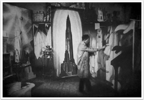
Hugh Ferriss (1889-1962) was an influential American delineator and architect. His drawings, masterful manipulations of shadow and light, influenced numerous modern architects (according to Daniel Okrent) as well as the pop-culture of his time (for instance Gotham City, in Batman)

Ferriss was born and raised in St. Louis, Missouri and he attended Washington University, where he received a degree in architecture. However upon entering the work field Ferriss soon discovered his preference and talent for rendering the designs of other architects rather than coming up with the blueprints himself.

I choose Ferriss because I’ve always loved his drawings and the way they manage to be both eerie and magical as well as realistic, simultaneously. Though I feel like the particular buildings that Ferriss rendered (most of them a part of the New York skyline) were pieces of art in and of themselves, his reproduction of them gave them a re-envisioning in which the building in question-usually just another skyscraper competing for attention in a skyline full of similar attention grabbers-became a focal point with its own dark story. Indeed he draws the buildings in night scenes, with the appearance the they are being lit up by spotlights or are surrounded by a halo. In some images (adding the the allure) its as if the images are floating in a fog. Although some of Ferris' more commercial drawings are done in graphite, he admitted to preferring to working with charcoal in a subtractive method because of its bold effects and malleability.

In my research I found a website put together by Columbia University student Michael Mallow, in remembrance of the enigma that was Ferriss’ success. Mallow writes: “By the mid-twenties, renderings by Ferriss had become almost de rigeur for successful competition projects; countless skyscrapers waited their turn to be bathed in the dark monumentality emanating from his drafting table. In these works a blasé department store appears as a giant lording over its block. Stodgy hotels cease to be stodgy hotels and become looming silhouettes emerging from the urban haze like shipwrecks. Ferriss went to grand new lengths in suppressing detail for mood, and clients loved it.” In my opinion Mallow’s description fully captures the mystery and intrigue that is Ferriss’ work.

If anybody is interested in seeing more of Ferris' artwork, I really like the following site, which has 341 drawing of his taken from the collection at Columbia University:

http://newsfeed.kosmograd.com/kosmograd/graphic_design/page/2/


Bibliography

Ferriss, Hugh. Power in Buildings, An Artist’s View of Contemporary Buildings. New York: Columbia University Press, 1953.

Ferriss, Hugh. The Metropolis of Tomorrow, with essay by Carol Willis. New York: Princeton Architectural Press, 1986.

Mallow, Michael. "A Ferris To Remember." Columbia University, New York. Web. 6 Nov. 2010.

http://www.columbia.edu/cu/bw/b_and_w/nov04/features/ferriss/ferriss.html


When I was working in D.C. this summer my office was down the street from the National Gallery of Art, and I would often go there during my lunch break. Wandering through the museum took a couple of visits; I could easily spend an hour there and only get through a couple rooms. One body of work stuck with me in particular, so much so that I came back just to visit that room. Thomas Cole's The Voyage of Life consists of four paintings that depict the different stages of life a man will go through. He starts with Childhood, then Youth, Manhood, and Old Age.

Throughout the series, Cole depicts life as a journey made on a boat floating down a river. As a baby, the boat emerges from a dark cave and enters into a green, lush world. The boat is steered by an angel who serves as the baby's guide. The sun is just rising, and everything about the scene suggests the promise of a new beginning. In Youth, the angel no longer steers the boat but watches from the bank as the young man looks eagerly onward. In the distance, we can see a castle in the sky made out of clouds but on the right side of the picture we see that the river actually leads to a rough and dangerous stretch. At this stage, the boy still has the possibility of every opportunity life has to offer except that we know he is inevitably going to have to face the difficult waters. In Manhood, the man is beset by the reality of his fate which is that he is at the mercy of god. He has his face raised to the sky as if beseeching for help from a higher power. Cole attaches a narrative to each piece and this quote aptly sums up his cynical view of life; "It is only when experience has taught us the realities of the world, that we lift from our eyes the golden veil of early life; that we feel deep and abiding sorrow; and in the picture, the gloomy, eclipse-like tone, the conflicting elements, the trees riven by tempest, are the allegory; and the Ocean, dimly seen, figures the end of life, to which the voyager is now approaching." Manhood is my least favorite just because it seems that Cole has these preconceived notions about the evils one is certain to face in adulthood. He also seems to believe that at this point, men are simply at the mercy of god, and they have no control over there destiny. Old Age is less frightening, although it shows an image of death; a peaceful still lake where an old man sits in the boat. The opening in the clouds is the offer of an afterlife as angels usher him upwards. The storm the man had once faced seems passed now, and all there is left to do is move on to the next stage.

Thomas Cole is the founder of the Hudson River School which was an American art movement in the mid 19th century that used realistic and detailed portrayal of nature and was very much influenced by romanticism. This is evident in The Voyage of Life where Cole uses minute details to enrich the image such as the hourglass that can be seen on the boat in every stage of life. In Childhood, the hourglass is full, but as the baby gets older it continues to empty. The romantic influences are somewhat different in an American context as Cole uses imagery of untouched nature with the mountains, colorful vegetation, and the dangerous river to depict a life journey. While some might see these details as leaving no room for interpretation, I like the idea that the artist is trying to send a specific message about the way he sees the world. For me, the details make the image infinitely interesting as I see something different every time I look at it.

Free Post

As I finished my final drawing class yesterday, I took time to really reflect on the past semester. Something that kind of stuck in my head is on the busride back to West after class, a classmate said to me, "You know, I really like that class now that its over". Looking back, I really enjoyed drawing, and always enjoyed going to class. Thinking over things, there are really two things that I struggled with. The first was probably true for most kids in any class, time. There were multiple assignments that I know could have been better with 6 extra hours of work, but I just found it difficult to find that time. I wish I had known in the beginning of the semester how time intensive some of these assignments were, because towards the end I was behind, and what little time I had was used to catch up on late assignments. The second thing I had trouble with was thinking of things to draw in my sketchbook. I would set aside an hour or so, just to draw in my sketchbook and just sit for an hour without drawing anything. Towards the end it was easier because the assignments all had a common theme and it was much easier to think of things that were related to that central theme. Looking through my sketchbook, it seems like I often just forced myself to pick random things in my room. When I was reading through the blog posts of other kids, I read one about losing the love and passion for art. Although I do not feel quite that way, I do understand somewhat where the author of that blog is coming from. In highschool I would sit in class and just draw and doodle all day. I think part of it has to do with a balance between freedom and requirement. Like when there is total freedom, no required drawing and no required topic, it is easy to draw. Likewise when both doing the drawing and what the drawing should be of are required, it is also easy. However I was required to do four sketchbook pages a week, but they could be of anything, it became very difficult. Overall this class served as a learning experience for me. I hope to take more art classes here at Duke, and although I am sure they will be different in some ways, the lessons I have learned in class will definitely help me.

Wednesday, December 8, 2010

Free Blog : Our Generation's Favorite Pastime


So for this entry, I decided to blog about Dr. Seuss. Now if you grew up in America or many other parts of the world, Dr. Seuss was the man that made you imagine and learn. As a child I loved reading and rereading the stories he made because of the colors, the characters, and the rhyme schemes, but a little more about Dr. Seuss. Theodor Seuss Geisel was born on March 2nd, 1904 in Springfield, Mass. His family was of German descent. Ted attended Dartmouth College where he became the editor-in-chief of the humor magazine Jack-O-Lantern. When he was caught throwing a party against school policy, Ted was removed from the magazine. In order to still get his work put in the magazine, he signed by another name and thus Dr. Seuss was born. Geisel had always covered his school notes with doodles so during his first years in graduate school to become a professor, it was no surprise when Dr. Seuss decided to leave and become an artist and illustrator. During the early parts of his art career, Seuss’s political cartoons and advertising works were published around the nation. Many of his political cartoons commented on the current WWII issues of the time.


In 1937, Dr. Seuss created his most well-known character The Cat in the Hat while working on a book he was illustrating. Who would’ve thought 70 years later, Dr. Seuss would be remembered as one of the most gifted artists of our time and still impact the youth of all generations.
Many people regard Dr. Seuss as a surrealist because his art was out of the ordinary in order to fit his fantastic stories. Seuss is prized for his meticulous color selection for each and every piece of art he created. Many of his books have saturated blues and reds in order to catch and keep the attention of a six-year-old. One of my favorite stories was “Oh! The Places You’ll Go!” This book talks a lot about growing up and teaches the listener that she can be anything she dreams of. In this book like many of Seuss’s other books, he uses specific colors such as soft oranges, blues, purples, and pinks to convey a magical atmosphere. Dr. Seuss artfully uses many of his illustrations to move the story along. Even though at this time many people moved to print and color machines, Seuss drew each and every preliminary sketch, line drawing, and final work for all his stories and as a young reader (and today) I marvel at the imagination and skill Seuss used to create the creatures he saw in his own head.
Oh, the Places You'll Go! (1990)


Though many people know Dr. Seuss for his children’s stories, he also painted and sculpted. For 60 years he created works surreal in nature. Recently his Secret Works were also released.


The Cat Detective In the Wrong Part of Town painting


No matter how you came to know Dr.Seuss, whether through his books, political cartoons, or through his Christmas specials, his work allows children to dream without limits.
Sources: http://www.drseussart.com/biography.html
Mariah

Tattoo Artists

I've always been fascinated by people who choose to get tattoos, but I'm particularly awed when people literally use their skin as canvases for art. You've all probably seen the more popular shows LA Ink and Miami Ink and understand what I'm talking about: those people who come in looking to squeeze just one more inch of ink onto a patch of flesh.

I used to only really care about why people were doing it. Was it some personal tragedy that they wanted to honor and remember? Did it have to do with a sense of self-empowerment, of being a cultural rebel? I'm sure all of these reasons and more are valid, to a degree.

But when looking at pictures of some tattoos, I realized the how and the what of the process is truly what makes tattooing "body art."

Consider Brandon Bond, an award-winning tattoo artist who has been featured in articles across the globe. He was considered a top consultant project that was attempting to develop ink that could be removed more quickly and easily with laser treatment (in case someone wants to get rid of that symbol that doesn't actually stand for "peace" but instead means "pasta").

Brandon has been tattooing for 13 years. He started by studying Fine Art at college in Texas. You can tell from looking at his work:

WWW.BRANDONBOND.COM.jpg www.brandonmfbond.com.jpg


unknown.jpg


unknown.jpg


unknown.jpg


If you examine his work, Brandon makes each tattoo a work of art. The flesh literally becomes a canvas. I respect tattoo artists for committing to work that is so obviously permanent. It's at once scary (how apprenticeships work for tattoo artists is beyond me), but I would imagine that buy building such an extensive portfolio, you creat an incredible testament to your skill. Your work is literally part of someone forever.


Ok, so I might not want to have the straightjacket man tattooed on my back for the rest of my life. But at least it looks really, really good.

Monday, December 6, 2010

New York Times Article

http://www.nytimes.com/2010/12/06/arts/design/06armory.html?ref=arts

I thought that this piece was interesting because it details an attempt by one individual to "modernize" a classic work of art, Leonardo Da Vinci's "Last Supper." This speaks to the tension inherent in classic art's place in modern society: do this pieces still speak to us as they did hundreds of years ago? Can an ancient or classic work of art still be relevant to today's society? Similarly, does the "modern", special effects, video, lighting magic, have a place in these classic works? The New York Times reviewer in this piece doesn't seem to think so, classifying British filmmaker Peter Greenaway's re-invention of De Vinci's famous piece as "a dud." However, he acknowledges that, "digital reproduction and video recording of art can be valuable, letting us see things we would otherwise never see." The reviewer then mentions a case of a valuable historical piece that would be subject to too much light and moisture damage if it were made available to the public. But, with the help of modern technology, the work could be re-created and thus made accessible to the public. It seems, then, that technology does have a place in classic art, even if it is only to play a supporting role.

Random Blog: South Florida Street Painting Festival !

A few of my most favorable memories of high school occurred at the annual Lake Worth Street Painting festival in West Palm Beach, Florida. Before I begin, I should mention that my high school had a pretty big arts program and one of our requirements each semester was to have at least 10 hours of volunteer hours in contribution to the arts program. Needless to say, many of us did not love this requirement, especially in the fall when we were forced to accumulate ten hours by scrubbing the painting and printmaking room floors. However, during the spring semester, the Street painting festival made this requirement almost non-existent due to the fact that we receive 17 hours of volunteer service for an event that most of us would have participated in anyway due to the fact that it was one of the biggest highlights of the year for most of us.
Each February, the city of Lake Worth would block off several blocks of street for an entire weekend exclusively for this event. It was really cool because it was an event that was entirely open to the public and anyone could participate as long as they submitted an application and a proposal for an image at least a month before the event. A person could choose to work individually or in small groups of 2-4 on any image that they choose as long as it wasn't a controversial image (it was a family festival so it couldn't deal with politics or nudity). After the image was approved by the street painting board, each artist or team of artists would be assigned a large block of street (usually at least 10x10 feet) and set to work from saturday morning to Sunday afternoon. Consequently, it wouldn't be uncommon to see a group of elementary school kids and their teacher drawing cartoons next to an elderly woman who was reproducing an exact replica of a Rembrandt painting. The variety you could see walking down the street was incredible!


My friend Johana and I really dirty beginning our work trying to replicate "Water Serpents" by Gustav Klimt.

I didn't know this girl across from us but she was doing a really amazing job on a Rembrandt piece.


Johana and I never finished the Klimt piece. You can see the Rembrandt piece behind it though.


Another year with another group and my friend's little sister doing "Lady with an Ermine" by Da Vinci. Really dirty.


A few of my friends. I think it was an original design.

Even though the festival was called the Street "Painting" Festival, this is a misnomer because all of the work was done in chalk pastels meaning that all of the work was only temporary. In actuality, it probably should have been called the street "Drawing" Festival but regardless of the name, this festival was an artist's dream! Basically, everything was free! Not only did they feed us breakfast and lunch, but the festival also provided all of the artists with an unlimited supply of chalk pastels. In an art store, I would estimate that each 32 piece box of chalk pastels could cost anywhere between 10-50 dollars depending on the quality. Furthermore, each stick of color is at most 3 inches long and when you think about trying to fill a 10 foot square with a three inch pastel stick, you can imagine how many pastel sticks were used with over 400 ten foot squares being worked on in the entire festival. I would estimate that it took an average of at least 2 1/2 boxes each year for my group to finish a piece so I still cannot imagine how much the festival must cost to put on each year and who funds it. Especially knowing the fact that in South Florida, it rains almost every afternoon for at least twenty minutes.
The process of street painting was a little more difficult than it may seem at first. There was definitely a lot more pre planning methods involved that were not required but that would definitely make the weekend easier. For example, a lot of people would enlarge and draw out the outline of their entire image before Saturday morning on a ten foot piece of paper. They would then use a pushpin to poke holes along the outline. Then on Saturday morning, the would lay the paper over their ten foot square of street and sprinkle baby powder into the holes so that when the paper was lifted up, they would already have a general outline of their piece and could begin working immediately. Other people, like me and many of my classmates took more of a "winging it" approach where we would simply sketch the image in freehandedly on Saturday morning. This probably wasn't the best approach if an artist wanted to realistically replicate a famous Van Gogh piece but part of the fun of the weekend was talking to artists and learning about new innovative tricks that you hadn't considered before. Many of us would also use large buckets of black or white non-permanent tempra paint to base the street with an even tone before drawing. Almost everyone in the festival would buy or borrow a tarp before the weekend so their art could be protected overnight and in prospect of the likely quick south florida afternoon rain.
All in all, the weekend was nothing but in credible fun! Besides just the art, there was live music, street performers, magicians, mimes, craft vendors, raffles, and most importantly: lots of festival food!! My school would have at least fifty students participating each year and as a result, the city would always group us together in the same section to work on. It was like a huge street party for us where we could spend the weekend together hanging out with friends, doing artwork, completely dirty and covered in chalk from head to toe, and accumulating our required volunteer hours at the same time. Even more, the festival is situated at a ten minute walk from the beach so many of us would take numerous and periodic beach breaks if we felt the need. It was always really funny on monday morning to see a large population of my high school five shades tanner and limping around after having spent almost twenty hours kneeling on the hard asphalt. The festival was one of my favorite high school experiences and if any of you are ever in the area during february I strongly suggest that you participate. It was always a lot of fun!
Here's a link to the website if you're interested in checking it out:
http://www.streetpaintingfestivalinc.org/


Saturday, December 4, 2010

Free Topic Post: I Love Charcoal

I first used charcoal two years ago. Didn’t explore it much—I didn’t draw very well then and I found it too challenging to figure out how to use a new medium and learn how to draw at the same time.

One year ago, in my school art classes (independent study and portfolio), I again discovered the wonders of charcoal. I was also taking classes after school at the Carrboro ArtsCenter, which furthered my introduction to the medium.

I first loved the thick dark line it creates without any effort. I then loved the move-ability of charcoal dust. Then, I loved range of values. Most of all, I love the tactile quality of working with my fingers to blend it.

One of my ArtsCenter teachers introduced me to the concept of sculpting a drawing, rather than drawing it linearly. This was revolutionary- I had for years struggled with my in ability to draw smooth pencil lines. Rather than drawing the lines of the face (I love to draw people), I would begin with the darkest places and draw in shapes of shadow.

After exploring this method with charcoal for several weeks, I stumbled upon a box of gray-scale soft pastels in the studio. Amazing! I continued working with the sculpting process, using the highly pigmented pastels. I mostly did fairly simple faces, just trying to get the main idea. I love(d) how powerful the gray-scale drawing are—I often did them on black construction paper, which made the white highlights appear that much more striking.

In the spring I took courses at the ArtsCenter in figure drawing, in which we utilized the quick expressive qualities of charcoal, and pastel painting, where I ventured into colored pastels.

This semester I feel like I’ve expanded on my previous knowledge—I’ve drawn more still-lifes than ever before and drawn my first landscapes and buildings. I’ve discovered that if I am using charcoal with a predominantly subtractive method I actually enjoy drawing still-lifes, which is great since I have always detested them. I haven’t been doing much of my own personally-motivated artwork this fall, so I’m looking forward to winter break when hopefully I can break out the pastels.

And that is how I came to love charcoal.

Friday, December 3, 2010

Commissions & What they tell you about the Artist

The Kiss, Gustav Klimt, 1908, Vienna, Austria


Gustav Klimt, 1911


Nightwatch, Rembrandt, 1642, Amsterdam, The Netherlands


La Primavera, Botticelli 1478, Florence, Italy


Looking at the renown museums of today, it’s hard to fully fathom they were once a new, revolutionary idea for viewing art. Back in the day, an art master’s work would be shown in private art collector’s manors, castles of the noble or large aristocrats’ apartments; majestic wood paneled floors, high, lush ceilings and wide impressive windows would assist in the atmosphere of a decadent setting. But art has a different name to it, now. It is not common for a patron to recruit an artist, tell them what they want and to what purpose the art would be created for. Instead, auctions or art shows are held, and art collectors will usually purchase a piece of art, having never met the artist with their own ideas for the piece. It seems with time we have completely lost the interaction step, of patron, artist and purpose. I’m not one to note whether that is better or worse - it’s clearly different - as society has changed in so many ways within the social customs of time. I’ve decided to analyze a few of my favourite works of art over the ages, so we can see the differences between the production of all of them, and if that (in any way) has to do with the quality or appreciation of the work.

The first painting I wish to explore is Primavera, by Botticelli, and was painted in 1478, for Lorenzo di Pierfrancesco de’ Medici. It is suggested that Lorenzo Medici commissioned Botticelli to embody the Neoplatonic ideas that were popular in the Medici family circles. Neoplatonism is a mix between both Christian doctrine ideals and the stories of Greek and Roman mythology and society. Primavera is known to many as “visual poetry” and is stylistically the embodiment of Botticelli’s characteristics. As a painting within the Early Renaissance, it is still regarded today as being one of the most famous of Boticelli’s works. Being commissioned, Botticelli had a firm understanding of what his patron wanted, and for that matter, was not given as much freedom as another commissioned artist who would later produce as epic a piece.

Rembrandt painted Nightwatch for Captain Barining Cocq and 17 members of his civic guards, in 1642 at the peak of Netherlands’ golden age. We can only assume, but many believe that the guardsmen expected a group portrait in which each member would be clearly recognizable. No one was expecting the explosion of emotion, motion and depth Rembrandt would give to a usually mundane, insipid and intense portrayal of military. The painting was commissioned to be hung in the banquet hall of the newly built "Kloveniersdoelen" (Musketeers' Meeting Hall) in Amsterdam. To me, it seems so much more fitting to hang in a regal Hall rather than a Museum, where it would employ the characteristics that impose intimidation.

The last painting I look to analyze is The Kiss by Gustav Klimt. This painting was created in 1908 for no patron. Klimt was an Austrian who had been commissioned in the early 1890's to paint with his brother, though their project was delayed because of conflict, and Klimt would never receive another public commission again. The Kiss is viewed by hundreds of people a day, in Vienna, Austria at the Osterreichische Galerie Belvedere Museum.

I feel as though this painting can show a lot more about the artist than Primavera and Nightwatch. This is because Botticelli and Rembrandt never exposed themselves rawly, for they never painted what was within their souls; they brought about their talents and shed them to the public through their patrons wishes, but they never were given the chance to just paint what they felt like (that we know of). Klimt, however, mostly painted for himself. He usually always depicted women or trees, in bright, organic styles that would later be known as Art Noveau. His emotions were caught into the paintings rather than just technique or style of the time.