Thursday, April 23, 2009

Vija Celmins

Vija Celmins was born in Latvia in 1938. When advance of the Soviet army began, Celmins and her family fled the country, heading towards Germany and eventually the United States in 1948. She experienced bombings and raids, death, and a constant anxiety of being separated from her family, all of which can be seen reflected in some of her work.
Having Settled in Indiana, Celmins decided to attend the John Herron Art Institue of Indianapolis in 1955. She also attended the Yale Summer School of Music and Art, where renowned gallery director, Eleanor Ward purchased one of her drawings. After receiving her bachelors degree, Celmins spent time studying in Europe, gaining a strong impression of Velazquez paintings. In the fall of 1962 she entered UCLA for her MFA degree.
Throughout her life and study of art Celmins has been influenced by artists like Leon Golub, H. C. Westermann, Arshile Gorky, Franz Kilne, Chuck Close, Brice Marden, Jack Tworkov, Eugene Carriere, Wilhem Hammerschoj, James McNeill Whistler, and Giorgio Morandi. After entering UCLA she was heavily involved in the Abstract Expressionism movement and influenced by Willem De Kooning. Eventually Celmins began to find this style artificial and from this point and throughout her career she began to move towards a more simplistic style, working with a monochrome palette. She later began to be interested in the works of Margitte and in Pop Art aesthetics as well as being influenced by Jackson Pollock.
As Celmins developed her style and worked more with drawings beginning around 1978, she began to incorporate imagery of WWII. These images mostly came from photographs. In her drawings, instead of taking just the image from the photograph, she would draw the photograph itself. In doing this she would create a piece with three visual layers, the photograph or image, the flat space of the ground, and the paper itself.

Bikini

(1968. Graphite on acrylic ground on paper, 13 3/8 x 18 1/4" (34 x 46.4 cm).)

Later, Celmins moved towards an interest in pictures from space. It was around this time that the first images of the moon began to appear. Her works began to feature images of the moon, its surface, and other astronomical bodies. She continued to move towards a very simplistic approach, with a focus on control, compression, and transformation.

Moon Surface (Luna 9) #1

(1969. Graphite on acrylic ground on paper, 13 3/4 x 18 1/2" (35 x 47.2 cm).)

Over time her drawings began to focus on images of the surface of the ocean, the night sky, and the surface of the desert, all rendered in great detail. Celmins has said that her images dispel romantic notions of the sublime in nature. Everything that Celmins creates is done out of extreme consideration and planning down to the smallest detail.
Her work has been features at the Whitney Museum of American Art, the Walker Art Center, the Museum of Contemporary Art, Los Angeles, the Institute of Contemporary Art, London, the Museum of Fine Arts, Houston, and the Metropolitan Museum of Art.
I am extremely fascinated with Celmin’s work. I have always found photographs of the night sky and other images of space to be some of the most amazing images. In class we have discussed the idea of representing the sky in our work and I have found this to be a very challenging thing to do. Rendering the surfaces of the ocean and the desert would require similar techniques I would think. Her ability to use graphite in such a way, creating images that look like a photograph is amazing to me.

Untitled (Ocean with Cross #1)

(1971. Graphite on acrylic ground on paper, 17 3/4 x 22 3/4" (45.1 x 57.8 cm).)

Her drawings are rendered in graphite on a sheet of paper covered in light gray acrylic. Celmins found that this technique reinforced the integrity of the paper and she tried to avoid direct contact between the pencil and paper.

Resources:
Vija Celmins: Dressins/Drawings. Centre Pompidou. 2006.
https://www.moma.org/collection/browse_results.php?criteria=O%3AAD%3AE%3A1048&page_number=1&template_id=6&sort_order=1&background=white

Fernand Leger

I chose Fernand Leger because I liked his way of making clear contrast between colors. Also, I love his technique drawing abstract pictures. Unlike other some too personal abstract drawings, I still can recognize the elements in reality in Leger’s.

Leger was born in the Argentan, Orne, Basse-Normandie, where his father raised cattle. Fernand Leger initially trained as architect from 1897-1899 before moving in 1900to Paris. He began to work seriously as a painter only at the age of 25. At this point his work showed the influence of Impressionism. A new emphasis on drawing and geometry appeared in his work after he saw the Cezanne retrospective at the Salon dAutomne in 1907.
In 1909 he moved to Montparnasse and met such leaders of the avant-garde as Archipenko, Lipchitz, Chagall, and Robert Delaunay. His major painting of this period displayed a personal form of Cubism—his critics called it "Tubism" for its emphasis on cylindrical forms—that made no use of the collage technique pioneered by Braque and Picasso. In 1910 he joined with several other artists, including Delaunay, Jacques Villon, Henri Le Fauconnier, Albert Gleizes, Francis Picabia, and Marie Laurencin to form an offshoot of the Cubist movement, the Puteaux Group—also called the The Golden Section. Leger was influenced during this time by Italian futurism, and his paintings, from then until 1914, became increasingly abstract. Their vocabulary of tubular, conical, and cubed forms are laconically rendered in rough patches of primary colors plus green, black and white.
Leger’s experience in World War I had a significant effect on his work. He produced many sketches of artillery pieces, airplanes, and fellow soldiers while in the trenches. In September 1916 he almost died after a mustard gas attack by the German troops at Verdun. During a period of convalescence in Villepinte he painted The Card Players (1917), a canvas whose robot-like, monstrous figures reflect the ambivalence of his experience of war. This painting marked the beginning of his "mechanical period", during which the figures and objects he created were characterized by sleekly rendered tubular and machine-like forms. Starting in 1918, he also produced the first paintings in the Disk series, in which disks suggestive of traffic lights figure prominently.


The Disks, 1918.
The "mechanical" works Leger painted in the 1920s, in their formal clarity as well as in their subject matter—the mother and child, the female nude, figures in an ordered landscape—are typical of the postwar "return to order" in the arts, and link him to the tradition of French figurative painting represented by Poussin and Corot. In his paysages animés (animated landscapes) of 1921, figures and animals exist harmoniously in landscapes made up of streamlined forms. The frontal compositions, firm contours, and smoothly blended colors of these paintings frequently recall the works of Henri Rousseau, an artist Leger greatly admired and whom he had met in 1909.
Mechanical Element, 1924.

They also share traits with the work of Le Corbusier and Amedee Ozenfant who together had founded Purism, a style intended as a rational, mathematically based corrective to the impulsiveness of cubism. Combining the classical with the modern, Léger's Nude on a Red Background (1927) depicts a monumental, expressionless woman, machinelike in form and color. His still life compositions from this period are dominated by stable, interlocking rectangular formations in vertical and horizontal orientation. The Siphon of 1924, a still life based on an advertisement in the popular press for the aperitif Campari, represents the high-water mark of the Purist aesthetic in Léger's work. Its balanced composition and fluted shapes suggestive of classical columns are brought together with a quasi-cinematic close-up of a hand holding a bottle.
Still Life with a Beer Mug, 1921. (Left)
The Woman With The Vase, 1927. (Right)
Sources
Dorival, Bernard. XXth Century Painters. Universe Books.
Photos from


Wednesday, April 22, 2009

Frank Gehry

Frank Owen Gehry was born in Toronto, Ontario, Canada on February 28, 1929. He received his undergraduate degree in architecture from University of Southern California in 1954 and for the few years after, he worked full time for various firms including Victor Gruen Associates and Pereira and Luckman Associates. Gehry then studied briefly at Harvard University’s Graduate School of Design and spent a year in Paris working for André Rémondet and studying great architects such as Le Corbusier and Balthasar Neumann before returning to the states and opening an office in Santa Monica in 1962 (About Frank Gehry: A brief biography). His practice expanded and in 2002, the Gehry partnership, Gehry Partners, LLP, was formed. Frank Gehry himself heads every single project that the firm undertakes and sees each project through to completion with the help of his staff as well as “Digital Project, a sophisticated 3D computer modeling program originally created for use by the aerospace industry, to thoroughly document designs and to rationalize the bidding, fabrication, and construction processes.” (GehryPartners LLP) Frank Gehry’s works include but are not limited to the Walt Disney Concert Hall in Los Angeles, Weisman Art Museum in Minneapolis, Dancing House in Prague, and his own private residence in Santa Monica, California.

Frank Gehry has described himself in the past as "a symmetrical freak and a grid freak" (architecture + process 140), but when we realized this was holding him back, he began to design by focusing on the forms that make up his structures.


These are a series of pictures showing the Ray & Maria Stata Center at MIT's development. The first shows Gehry's original sketch of how he visualized the project. As you can see, Gehry's sketches are extremely messy with no real defined shapes or distinguishable features. He does a lot of scribbling and conceptualizing while putting his ideas down on paper, resulting in vague drawings that make viewers unable to form the final product in their minds.

The second shows a design model in the process of being changed according to Gehry's desires. Similar to his sketches, Gehry's design process models are very messy and involve a lot of crumpled paper or various textures that can be achieved from everyday items. His models seem more artistic as opposed to architectural. In fact, when I first saw pictures of his models I wondered how they could possibly translate to actual structures on a larger scale.

The third photograph shows the final design model for the building. Obviously it looks more polished than the design process models and does resemble a building. However, it still retains its artistic qualities and curvilinear edges that make it unique to Gehry's style of design.


These two pictures are of the Nationale-Nederlanden Building in Prague, Czech Republic Gehry designed in the mid 90's. Once again, the first is a sketch of Gehry's design done with the same messiness as the Stata Center. I found it interesting while reading about this building that after Gehry designed the first tower resembling a dress, everyone involved laughed at him and Gehry said in his interview that "They didn't understand where [he] was going" (architecture + process 170). I think that is a prevalent characteristic of Frank Gehry's.

The second photograph is of the finished building. You can make out the shapes that Gehry drew originally in the final design but the details found in the structure are not represented in the sketch. I absolutely love the way this building looks because it is extremely playful with the wavy lines and the random placement of windows. It has a cartoon-like feel to it and I think to be able to pull this off in a building is phenomenal.

Friedman, Mildred. Gehry talks: architecture + process. New York, NY: Rizzoli International Publications, 1999.

“About Frank Gehry: A brief biography.” Frank Gehry – Pritzker Architecture Prize Laureate. 31 March 2008 .

GehryPartners LLP. 2007. Frank O. Gehry & Associates. 31 March 2008. .

This is... Frank Miller

Frank Miller, born January 27th, 1957, is one of the most respected and influential comic book and graphic novel artists, on par with Alan Moore or Art Speigelman. While he has dabbled in a number of roles, including writer, movie director and screenwriter, I will focus on his pencil and ink works. Frank Miller, as so many of the artists involved in the graphic novel medium, grew up reading and appreciating comic books; however, he moved away from the medium during his teenage years and focused on other fictional forms, including detective novels and Hitchcock's films. Throughout his formative years, Frank Miller maintained a sharp interest in fantasy, regardless of the medium, though his melding of fantastic and realistic elements is often rather toned-down. Miller made his professional splash when he took over Daredevil in 1979, quickly turning the fading, obscure warrior into a fan favorite.

Artistically, Frank Miller's expressive, rather loose drawing style sets him apart from the vast majority of other mainstream comic book artists. Not a fan of the photorealism to which many of his colleagues strive for, such as Alex Ross, he considers sequential art to be more of an abstract, mannerist medium in which sharp visual dichotomies, such as black ink on white paper, are used to convey a story. This renders his visual style rather dynamic; his sketchy, almost cartoony characters seem to convey their emotional, internal states more directly through their silhouettes. In a way, this slight exaggeration of the human form to enhance the internal transparency of its subject is an interesting compromise between the naked expressiveness of free-form cartoons and the restrained depictions of realist drawings.

While Frank Miller has been the contributor in some fashion to a number of efforts during the past thirty years, I will focus on his three most famous works: Batman: The Dark Knight, Sin City and 300. The first of these is the oldest, having been released in a four part run in 1986. In it, Miller redefines the Batman mythos, breaking away from the gradual softening of the character and highlighting the complex inner turmoil that necessarily accompanies an individual willing to don a mask and take on the grittiest segments of society. Gone is the kid-friendly sunshine of traditional Superman comics, as well as the ever-expanding constellations of superheroes that have little human left in them. Instead, Miller explores a scary world that can only be tamed by a scarier man. Batman, then, becomes both more human, through his internal turmoil, and more superhuman, by our greater understanding of the gulf between the psychology of this man and the common folk. This work was fundamental, along with Alan Moore's Watchmen, for legitimizing the superhero comic book as an art form.

In Sin City, which, like 300, has recently made new inroads into popular culture due to the successful movie version, Miller combines two loves: comic books and hard-boiled detective novels. Steering completely away from men in tights, the series is an homage to the seedy city underbelly often explored in film noir, where prostitution, mafias, drug deals and other illicit activities serve as the harsh background for the even harsher protagonists. Artistically, the series, first published in 1992 and ongoing, is renowned for its stark black and white style. At times, the panels become positive space/negative space optical illusions, utilizing characters as both foreground and background. Not shying away from brutality or experimentation, both visually and narratively, this series has stretched the boundaries of the possible in the graphic novel medium.

Finally, we turn to 300, a limited edition oversized graphic novel released in 1998 which is now a firm element of mainstream attention after the very successful 2007 film. In the graphic novel, Miller set out to depict the battle of Thermopylae, in which a small band of Spartan warriors hold off the massive Persian army, at the cost of their lives. Strongly influenced by the 1962 film The 300 Spartans, the book has a cinematographic ambiance, with larger-than-life depictions of battles, army movements and the rugged Greek landscape. While obviously restricted by the historical nature of the conflict, Miller still manages to infuse the yarn with his trademark elements of intense emotions and extreme, almost disjointed depictions of violence. The Spartan warriors, in particular, come to life in a way that transcends their historical origins, in a way becoming more legendary through their more human, flawed depictions. Another important stylistic effect is the near minimal dialog, particularly in the action sequences, which highlights the film-like quality of the work.

References:
Milo, George (ed). "The Comics Journal Library, Volume Two, Frank Miller: The Interviews 1981-2003". Fantagraphics Books, Seattle, WA, 2003.
Miller, Frank. "Batman: The Dark Knight Returns". DC Comics, New York, NY, 1986.

Images taken from:
"Frank Miller". Wikipedia: The Free Encyclopedia. .


Theodor Geisel (Dr. Seuss)

Most people know Dr. Seuss as a children's book writer, but they forget that he also illustrated his books and worked as a political cartoonist for many years. Theodor Geisel was born in Springfield, Massachusetts in 1904. His parents, Theodor and Henrietta, were German immigrants. As a child, Geisel doodled constantly even though he never had very much formal art training. Dr. Seuss uses inspiration from his hometown very often in his books. For example, his first book, And To Think I Saw It On Mulberry Street, took its name and setting from Springfield.
After high school, Seuss went to Dartmouth College and wrote for a humor magazine there. Because of his father's wishes, he continued on to Oxford for graduate school, but never completed his degree. He did meet his first wife there, though, and they were married in 1927.
Dr. Seuss returned to the U.S. after Oxford and began working as a political cartoonist during World War II. He worked for many publications doing cartoons and advertisements, but the main magazine he worked for was PM. In just two years, he wrote over 400 cartoons. His political cartoons mainly focused on the war and were critical of Hitler and Mussolini. He also criticized the isolationist movement and Americans who were not supportive of the war. Dr. Seuss's children's books also held political statements, though not as obvious as the cartoons. Examples include Yertle the Turtle as a depiction of Hitler and The Sneeches as a statement on racial equality. Through his drawing, Seuss was able to make statements about many political issues during and around the time of the war.
Dr. Seuss also illustrated his children's books, which he is most famous for. His drawings are very loose and curved; he uses almost no straight lines in any of his drawings, even buildings. He is also very unrealistic as he creates new animals, machines, and buildings. During the cartoon period, Dr. Seuss used mainly pencils and shading. When he started writing children's books, he used pen and ink more often.
I chose Dr. Seuss because he surprises his audience with his work. After seeing his children's books, many people would not expect that he also wrote clever and powerful political cartoons. His drawings are fairly simple, but his imagination allows him to create very unique and bold images. The first picture shown below is one of his political cartoons, drawn with pencil. This cartoon shows Seuss's anti-isolationist feelings and criticisms. American isolationist figured that Hitler would not get to America if they did not enter the war, so they were willing to just sit back and stay out of the picture, even though Hitler was attacking many European countries. The second picture below is the book cover for Yertle the Turtle and Other Stories. The picture shows Yertle the Turtle standing on the other turtle's backs in order to reach the moon. This is symbolic of Hitler using other countries for his own advantage, regardless of how it hurt them. Yertle the Turtle is a good example of how Dr. Seuss's political ideas reached his children's books, even though they didn't have to be political statements. The third picture is from Dr. Seuss's book You're Only Old Once! This picture shows the imagination of Dr. Seuss as he turns an ordinary stretcher into a curvy and interesting machine. This is also an example of the pen and ink that Seuss used in his children's books.


Sources:
"All About Dr. Seuss" from http://www.catinthehat.org/history.htm

Political Cartoon from Dr. Seuss Goes to War at http://orpheus.ucsd.edu/speccoll/dspolitic/Frame.htm

Book cover from Amazon.com

You're Only Old Once! by Dr. Seuss

Tuesday, April 21, 2009

Marc Chagall

Though Marc Chagall was born in 1887 a poor Jewish boy in the Russian Empire, Chagall is not an 19th century artist. On the contrary -- Chagall is one of the preeminent artists of the 20th century, and one of few artists multi-talented enough to leave some sort of impression on almost every major art movement of the century. His paintings draw from many different artistic movements, with his distinctive style drawing both from classical Russian expressionism and French cubism. Atop his talents at painting, Chagall was an accomplished artist of stained glass, tapestry, ceramics, and many other forms of art -- Chagall exemplified the multi-talented artists of the mid 20th century.

Chagall was born on July 7th, 1887, in the city of Vitsyebsk (now in Belarus). Chagall recieved a formal art education in St. Petersburg, and moved to Paris in 1910. On the eve of World War I, Chagall painted and formed the backbone of his distinctive, eventually famous style in a number of important works, including "I and the Village", "The Cattle Dealer", and "The Fiddler." Chagall moved back to Russia during World War I and was originally sympathetic to the revolution, but upon being declared a persona non grata by the post-revolutionary Soviet authorities, moved to Moscow to get away from the centeral Soviet authority. In Moscow, Chagall designed sets for many theater productions and painted several important murals, most of which still stand today.

He returned to Paris in 1923, and would live there for most of the rest of his life -- he fled France during the Nazi occupation in World War II, as he was a Jewish artist and to stay in close proximity to the Vichy government was to risk death in a concentration camp. Thus did he flee to the south of France, where he was once captured but soon released under pressure from the United States. He was sent on a boat with his family to the U.S.A., where he would live for 5 years and produce some of his most important, expressive mid-period work (including "L'Obsession" and "The Wedding"). His later life was marked by art that, in general, included less social commentary with more expression, as evident in pieces such as "The Grand Parade", an almost entirely expressive, colorful piece. He died in 1985 at the age of 97, one of the most accomplished Jewish artists in history.

Though he is, as previously mentioned, an extremely multi-talented artist, this particular post is focused on one particular aspect of Chagall's art. That is, his drawings. Chagall drew constantly, and his style is extremely distinctive. It is not unlike his late-period expressive work; Chagall's sketches utilize an economy of line and speed of stroke that rivals any. There is a clear disconnect between the drawn out, virtuoso sketches of Picasso or Ingres; Chagall's sketches are messy, impulsive, and aren't always entirely scrutable. But the energy of his sketches is wonderful, and his studies are brilliant in their use of sparse line and shading to form interesting, intuitive images. Here are several of my favorite sketches from a wonderful little book I checked out from the library.


In this sketch, Chagall plays a bit of a trick on the viewer. The eyes are drawn to the woman, as we attempt to make sense of the form of the drawing. We naturally observe the object atop her head and imagine it a hat. This is wrong. It is actually a... well, actually, I have no idea what it is. Is it a horse? Is it a dog? Is it a creature he imagined in a state of happiness? It could be any of those things, but whatever it is, the creature's face is expressive enough to make it both surprise and amuse the viewer. In that sense, this scribble is just as meaningful as a large scale classical work. It succeeds in its aim -- expressing emotion -- and succeeds in an amusing, fascinating manner.


This sketch amuses me not in its technical skill, but rather in the lack of it, and in his efforts to test things out instead of creating a perfect drawing. This drawing strikes me as a very humanizing sketch -- while it's expressive, it's clear that Chagall is trying techniques he isn't sure are going to work. It looks as though he is experimenting (and, in fact, this was one of his first drawings with lithograph crayon). There's nothing wrong with experimenting, and there's nothing wrong with occasionally having a sketch that doesn't look like a finished piece, or even a very coherent one. Sometimes, experiments are their own end, and Chagall's sketch here struck me as a great example of this.

This drawing is interesting. It's a great example of a quick but accurate piece -- the sketch feels like a drawing of a woman, despite the fact that many of the proportions are wrong and it's hard to tell where the drawing is being drawn from. There is this spatial emptiness, and this lack of awareness as to where the viewer stands relative to the object of the art, that Chagall's sketches exemplify and which I personally find extremely intriguing.

Anyway, that's my piece. If anybody wants to see some of his sketches, I'll be returning the book to the library soon! It's a great book of art if you can get past the initial feelings of confusion, and I highly recommend it.

------

Alexander, Sidney, Marc Chagall: A Biography G.P. Putnam's Sons, 1978.
Lassaigne, Jacques, Chagall Unpublished Drawings Skira, 1964.

Some information & paintings were acquired from this website.

Whaam! Roy Lichtenstein

Washing Machine

Whaam!


Hopeless


Pop!


Roy Lichtenstein: The Comic Strip as Serious Art

Contrary to popular belief, Michael Jackson was not the original King of Pop, or at the very least, not the kind of Pop that is relevant to this paper. Of course, I am referring to Pop Art, and one of the pioneers of this artistic movement was Roy Lichtenstein. Born on October 27, 1923 in New York City, Roy Fox Lichtenstein is most famous for his larger than life creations. His works brought an edgy, deliberately commercial feel to the world of art. He is one of my favorite pop artists because his works are more than just statements about the post-industrial milieu in which he worked, they are also pithy and incredibly dense with a subtle political and social commentary. His works are surprisingly humorous at times, especially some of his early comic book adaptations, which have a deliberately melodramatic quality.
He was educated in Manhattan at the Franklin School for Boys, where he first explored his natural talents in art as a hobby rather than part of his formal coursework. Later he enrolled at the Art Students League of New York, where gained some formal instruction in art from another famous painter, Reginald Marsh. In 1943, barely having moved to study art at Ohio State University, he was drafted into the army during the Second World War. After three years of service, he returned to the states and resumed his studies at Ohio State, where he was significantly influenced by Hoyt L. Sherman, who was his teacher and mentor of sorts. He graduated in 1949 with a Masters of Fine Arts from Ohio State and married Isabel Wilson in the same year.
In 1951, Lichtenstein had both his first artistic exhibition at Carlebach Gallery in New York and moved to Cleveland, where he would spend the next six years of his life. He would undertake various positions to make ends meet, even working as a window decorator for a time. His early work is influenced by both Cubism and Expressionism, neither of which would be the predominant styles of his later pieces. Lichtenstein started teaching at the State University of New York in 1958, but eventually left this office to teach at Rutgers University. It was here that he would start developing his cartoon-like, early pop-influenced artistic style.
Lichtenstein did not attain a certain level of fame until the mid-to-late 1960s. During this period, he designed some of his best-known works, including Pop! ,Girl with hair, and Blam!(1962) What makes these works characteristic of Lichtenstein’s style is that they are not only abstract and minimalist in their use of line and primary, bold coloring, but they have a comic-book-like design which makes them prime examples of early Pop Art. This rise to fame was accompanied by a commission from BMW to paint a Pop Art version of the BMW 320i, which he designed in 1977.
One of Lichtenstein’s most famous works is his Whaam! (1963) which depicts a fighter plane launching a rocket into another airplane. The second plane is seen exploding into a ball of red and yellow flames, with the word “Whaam!” diagonally arranged in block letters on top of the explosion. The scene is taken directly from two panels in a DC comic book, in true Lichtenstein style. Part of the appeal of comic book scenes for Lichtenstein seemed to be the fact that they employed highly emotional content but in a very commercial and detached manner. Simple dot-matrix patterns on relatively cheap materials still managed to contain poignant subjects like war or destruction (as in Whaam!), as well as heartache and love (as in Hopeless, 1963).
Still, one of the central difficulties that confronted Lichtenstein, especially during the early critical receptions of his pieces, involved the “limits of articulating an identity as an artist when one’s work is so intertwined with the languages of advertising and mechanical reproduction” (Lobel 41). In other words, it is rather difficult to forge a unique style and identity from works that were intended for commercial consumption and meant to be easily reproduced. In his ability to take the ubiquitous and commercial and transform it into high art, Lichtenstein managed to set the bar for the Pop Art movement. His works can transform the everyday into something grand and imposing.
The fact that his canvases are unusually large, for example his 143cmX174cm depiction of a hand loading a washing machine, attributes a grandiosity to his work’s unassuming subject matter. In the picture I have posted, there is a direct comparison between the image that was originally the inspiration behind Lichtenstein’s Washing Machine and the actual piece. One thing that immediately stood out to me was the complete absence of labels or brand names. Even the hand seems strangely generic as it pours out the contents of an unmarked yellow box that, for all its lack of identification, still clearly conveys the message of consumerism.
Still, it seems that Lichtenstein’s purpose in creating his stylized versions of mass produced images was not simply to represent the brands themselves. In fact, their complete absence from the scene is more than enough to indicate this was not his aim. Lobel suggests that this lack of concern for the specific packaging of familiar brands was a central feature that distinguished his work from the other major Pop Art figure of the time: Andy Warhol.
Where Lichtenstein may distort and obscure logos to the point of making them unreadable, Warhol’s main focus seemed to be showcasing and capitalizing on the brand’s design, so as to emphasize the commercial aspect of the subject matter. It seems to be that one way of reading this stylistic difference could be that the two artists had different aims in their use of commercial products. Whereas Lichtenstein would signal out the peculiarities of a single item through simplification and distortion, Warhol focused on the “standardization and repetition of consumer products” (Lobel 44).
Toward the end of his career, he experimented with a variety of artistic mediums from metal to printmaking. His work gained a tremendous amount of commercial success. Ironically, as he tried to eschew the limelight, some of his contemporaries, notably Andy Warhol, relished the opportunity to bask in the glow of their renown (and, for Warhol, this renown usually added up to notoriety). So famous and well-received were his later works that one actually sold for a record breaking amount of money, 5.5 million, making Lichtenstein an icon in his own time.
In 1997, he gave an interview in New York where he discussed his approach to his art. His approach to his art was part methodical planning (stating that his works were almost always planned in sketches before preparing the canvas) and part humor. The last point is especially interesting to me, he describes even the most heavy-handed of his works as containing a kind of humor because of their style. In speaking his more serious paintings, he stated “…the method, the cartooning, so that the dots, black lines, things like that, sort of tell you that its not serious art” (Roy Lichtenstein Interview). But then again, serious art can be funny, with an irreverent tinge to it. Yet, it seems that this characteristic approach to his work as something with a potential for seriousness as well as humor also proved central to the Pop Art movement as a whole.
Sadly, Lichtenstein died of pneumonia in September of 1997, in New York, but not before revolutionizing the art world by renovating and reinvigorating the use of the everyday, the humorous, and the just-plain-overlooked, in serious art.


Bibliography
Lobel, Michael. Image Duplicator: Roy Lichtenstein and the Emergence of Pop Art. Yale Publications in the history of art. Yale University Press, 2002.
Roy Lichtenstein Foundation. http://www.lichtensteinfoundation.org/frames.htm
Roy Lichtenstein Interview. Excerpted from David Sylvester's "Some Kind of Reality.".Originally recorded in April 1997 in New York City.

Jackson Pollock

Jackson Pollock is known for his abstract paintings. He abandoned traditional painting tools such as brushes and poured paint directly onto large canvases placed on the floor. In his paintings, he strove to express his "unconscious mind". He admired and was inspired by modern artists such as Pablo Picassa and Joan Miro. His style was also influenced by Native American and Mexican mural artists.

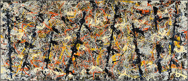
Jackson Pollock was born in 1912 in Cody, Wyoming. He grew up in California and moved to New York with his brothers in 1930. In New York, he studied at the Art Student League, under the guidance of Thomas Hart Benton, the leader of the Regionalist school of painting. Although later Pollock departed from Benton's style radically, Pollock showed Benton's influence. For example, one of Benton's idea was that "a horizontally oriented picture should be organized by means of a series of vertical poles placed at intervals on the canvas, around which rhythmic sequences could be arranged". Pollock's last painting, The Blue Poles ( Fig. 1) , clearly demonstrated this organization. Later in the 1930s,, Pollock worked with the Mexican mural painters Diego Rivera, Jose Clemente Orozco and David Alfaro Siqueiros on large mural commissions for political rallies. These artist were inspired by the Mexican revolution of 1910-20. They wanted to transform both the practice of painting and the society in which the artist lived. Siqueiro believed that in order to reflect the new society that would be ushered by communism, the material and techniques of painting had to change. Pollock later adopted Sequeiro's disdain for traditional tools and started to use sticks, trowels, knives, etc, instead. In the painting Mural 1943 (Figure 2), Pollock showed his interest in abstract art. His experience opened up a new way of painting for him and he eventually developed his own "drip" painting style later.

Pollock first started pouring paints onto pre-existing painting as a way of obscuring the forms. In the late 1940s, he moved to a more complete abstract art such that both figure and form were absent. He believed that his paintings were not only reflection of his "unconscious mind", but also of the culture of the time he was living in. He believed that in the modern age, painting should not be an "illustration of / but the equivalent/ concentrated/fluid." Later, he stopped giving titles to his painting and instead used numbers (Figure 3). He remarked that the lack of title offers the audience a chance to focus on an area of the painting that attracts them. The audience should not try to speculate what the artist has in mind when painting. Rather, he argued, art should be free and the audience should evaluate and feel the painting based on their own experience.


Unfortunately, his career was cut short when he died of a car accident while driving under influence in 1956.

Figure 1. Blue Poles: Number 11,1952


Figure 2. Mural 1942 oil on canvas


Figure 3. Number one, 1948

Reference:

Cernuschi, Claude. Jackson Pollock, "psychoanalytic" drawings. Durham: Duke UP in association with the Duke University Museum of Art, 1992.

Pollock, Jackson. Jackson Pollock's Blue Poles. Washington D.C.: National Gallery of Australia, 2003.

Walt Disney

Everybody knows Walt Disney. He was raised around the Chicago area, where in high school, he began taking night courses at the Chicago Art Institute. He became a cartoonist for the school newspaper, and his subjects were very patriotic, focusing on WWI. After graduation, he wanted to become an artist and sought a job as a cartoonist for a newspaper. When he could not find one, his brother got him a temporary one at the Pesmen-Rubin Art Studio, and he began to design ads. There, he met cartoonist, Ubbe Iwerks and decided to start their own company, called "Iwerks-Disney Commerical Artists." Disney temporarily left to work for the Kansas City Film Ad Company to earn money, where he made commercials based on cut-out animation. Thus, he decided to become an animator. After borrowing a camera from the company and learning about animation, he decided that cel animation was a lot more promising than cut-out animation. He then decided to open up his own animation business.

He started out animation "Laugh-O-Grams," where we hugely successful around the Kansas City area. This enabled him to acquire a studio and hire many more animators. However, he was unable to pay the salaries and went bankrupt, causing him to venture to Hollywood, California. There, his partner, Iwerks, began animating "Oswald the Lucky Rabbit" for Universal Studios, working under Disney Studios. This also became a huge success. However, Disney lost the rights to Oswald when he decided to negotiate for a higher fee and was denied. Disney now had to come up with a new idea, and Mickey Mouse was born. The rest, as we all know, is history.

Disney's style was obviously very cartoonish, without employment of nuanced shading or blending. His was mostly line work, which outlined the shapes and features of his characters. Nevertheless, he was able to incorporate a clear sense of emotion and direction in his figures, however much exaggerated, and gave his drawings life and imagination. Using just lines, he created something that fitted together incredibly well and composed a story. His revolutionary use of color in his animations also won him great acclaim. Thus, he is undoubtedly the most important figure that ushered in the Golden Age of American Animation.

In this drawing, it can be seen the incredible emotions that the lines convey. Minnie is unabashedly laying kisses on Mickey. It is evident that she is very into it, as her eyes are closed and her body conveys a leftwards direction towards Mickey. Mickey's face conveys obvious elation. His feet are crossed awkwardly and his hand is twisted into a shape, giving a sense of powerlessness.


In this drawing below, Donald is displaying obvious frustration with the ticking clock. His eyes are focused on the clock, his mouth is in a frown, and his head is twitching as conveyed by the little lines around his head. Even these simple lines can convey such information. It is not a complex drawing. There is the necessary shading, but all the relevant information is given by the lines only.


Finally, this drawing presents a very funny mood. Mickey's body is unmoving and his finger is raised to his lips to hush. Fish imitate his body language; ironic, since he is trying to fish, and obviously, the fish are quite aware of this. Everything comes together, again, to convey the story.


Sources:
http://www.thefineartcompany.co.uk/Disney/disney.htm
http://en.wikipedia.org/wiki/Walt_Disney
http://en.wikipedia.org/wiki/Golden_Age_of_American_animation

Pablo Picasso

Pablo Diego José Francisco de Paula Juan Nepomuceno María de los Remedios Cipriano de la Santísima Trinidad Ruiz y Picasso (Pablo Picasso) was born October 25th 1881 in Malaga, Spain. His father, Don José Ruiz y Blasco was also a nature painter who specialized in painting birds as well as an art professor. His father began training him in figure drawing and oil painting at the age of seven. Picasso flourished under the tutelage of his father, becoming so fascinated with art that his school work began to suffer. In 1891, Picasso’s family moved to La Coruna so that his father could serve as a professor at the School of Fine Arts. After the death of his younger sister, Picasso’s family moved to Barcelona where Picasso was admitted into the School of Fine Art at age 13. While at school, Picasso was undisciplined; however, his charismatic personality earned him many friendships that would be continue throughout his lifetime. Later, at age 16, Picasso attended the very prestigious Royal Academy of San Fernando in Madrid. Unfortunately, his poor studying habits followed him, and he soon stopped attending his classes. In 1900, Picasso moved to Paris where he lived in great poverty with his friend, the poet Max Jacob. In Paris, the artist was so poor that he had to burn his paintings for warmth. Nevertheless, it was in Paris that Picasso rose to fame as a painter.

Although noteworthy for being the cofounder of Cubism, Picasso’s style actually went through several different phases. His training with his father was extremely tradition, and consequently, his earliest paintings emphasize realism. After moving to Paris, Picasso began painting more somber pictures, often portraying prostitutes and beggars in depressing shades of gray and blue. This style is juxtaposed by the next stylistic trend of Picasso, called the Rose Period. During this period, Picasso drew more cheerful subjects such as acrobats and clowns, using warmer colors. Around 1909, Picasso and George Braque began the cubism movement. The movement consisted of taking apart objects and analyzing them for their shape, resulting some very abstract results.


Minotauromachie was made in 1935. Often considered the author’s greatest print work, Minotauromachie shows a girl leading a blind Minotaur. The piece exists as an engraving. An interesting point about this piece is the convoluted narrative that it tells. The strange nature of the layout makes it difficult to tell exactly what is going on, leaving much of the story to the viewer’s imagination.


Studies of Bulls was made in 1946. The drawings are done in pencil with collage. The bull motif carries over from the Minotaur piece. This work illustrates Picasso’s mastery of stylization. Here he effectively reduces the bull to the minimum number of lines necessary. Yet it is still possible to tell what the subject is.


Seated Nude was made in 1906. The piece was done in Charcoal and is indicative of a shift in Picasso’s work. Seated Nude marks the end of the “Rose Period” in which Picasso often drew very skinny acrobats and street performers. From this point on he began adding more weight to his subjects. The replacement of the subject’s face with a mask almost implies some sort of social commentary, although the artist never gave one.


Sources: Picasso on Paper by Patrick Elliot

Wikipedia.org

John Heartfield


John
Heartfield


John Heartfield is a 20th century German artist that developed a type of art where he would montage a mix of different photos in attempt to portray his narrative to his audience. I chose John Heartfield particularly because i am a history major with a focus on military history particularly World Wars I and II, which is right around the time Heartfield became particularly famous especially in Germany. Heartfield was born 18 June 1891 by the name of Helmut Herzfeld but changed his name in 1916 to John Heartfield because to satirize the anti-British sentiments in Germany. Heartfield was a communist in Germany and was against all his nationalistic counterparts. Thus, his name was a joke for him to have in Germany at the time. When the nationalists took power in 1933, Heartfield left Germany for Czecheslovakia where he would do the majority of his famous artwork. John was particulary anti nazi and tried to portray the Nazi's as to undermine their propaganda. In 1938, he left his host nation for England because Germany invaded. He moved back to Germany after WWII and he died in April 1967.

I chose Heartfield because of important historical era in which he did his work, but i truly believe his work has powerful messages even though most of his work is political satyre. Political satyre has always had a place in history and his work in Europe is important from a historical perspective. Germany did not allow many anti Nazi printings to make it to press but somehow Heartfield was able to make his voice heard.
Heartfield's art may not be modern persay, but he paved the way for photomontage of the future and political satyres that are presently used. He is a little known artist to us but historically, he is an important figure, and I hope you enjoyed some of his work.

Michael Graves


I am a big fan of Michael Graves. I own both the teapot and the wooden cooking spoon he designed for Target. Although I recognize why many do not like his work (it is overly playful and showy), I think he does an excellent job of making aesthetically appealing buildings in the Postmodern genre that still have many of my favorite modern elements. Although he has a recognizable style, each building is unique in its environment. Graves is particularly interesting because he relies so heavily on hand sketches and architectural renderings in water colors for his projects. He has produced some truly remarkable pictures, including ones of the Swan and Dolphin Hotels he designed for Walt Disney World in 1990. 

Graves was born July 9, 1934 in Indianapolis, Indiana. He attended University of Cincinnati and got his master’s degree from Harvard University. In 1964, Graves founded his own practice in Princeton, New Jersey. Concurrently he has taught at Princeton University as Robert Schirmer Professor of Architecture, Emeritus. His company, Michael Graves & Associates has been highly successful, designing not only commercial and residential buildings but also interior design objects such as kitchen appliances and furniture.


Graves is considered one of The New York Five. This refers to the five architects that appeared in the Museum of Modern Art’s 1967 exhibition dedicated to architectural modernism. The group includes Peter Eisenman, Charles Gwathmey, John Hejduk, and Richard Meier as well. Each of these individuals took modernism to the next level (Eisenman for example took a deconstructivist route while Meier deals with structuralism and complexity). Graves is a pop-architect in tune with historicism and allusion.


Graves was elected a Fellow of the American Institute of Architects in 1979 and was awarded the National Medal of Arts in 1999 and the Gold Medal from the American Institute of Architects in 2001. Some of his most famous buildings include the Snyderman House (Indiana, 1972), the Portland Public Service building (Portland, Oregon, 1982), and the Swan and Dolphin Resorts at Disney World (Orlando, 1990).


Sources

Five architects : Eisenman, Graves, Gwathmey, Hejduk, Meier. New York : Oxford University Press, 1975.

Michael Graves. 18 Apr. 2009 .

"Snyderman House, Fort Wayne, Indiana, 1975; architect: Michael Graves." Process: Architecture. 7 (1978): 120-125.

Sir John Tenniel

Sir John Tenniel was born in 1820 in London, England. He studied at the Royal Academy of Arts and in 1836 he sent his first picture to the exhibition of the Society of British Artists. In 1845, Tenniel submitted a cartoon, An Allegory of Justice, to a mural competition for the new Palace of Westminster, and received a commission to paint a fresco in the House of Lords. He became well known for his original and good-humored political cartoons in Punch, but is best remembered for his illustrations in Lewis Carroll's Alice's Adventures in Wonderland as well as Through the Looking Glass. Sir Tenniel's style of drawing ranged from "high art" to "scholarly caricature." Roger Simpson described it as "an often forced formal art contrast[ing] with a comic art of almost unprecedented vigor and inventiveness" (Sir John Tenniel, 11).

The first drawing is called "Do I look very pale?" and was drawing by Tenniel in 1872. It was an illustration for Through the Looking Glass. The second drawing is called "London's Nightmare," drawn in 1866. The last drawing is called "A Pan-Anglican Oversight," drawn in 1867.

I chose these three drawings because they show the different types of drawings that Sir John Tenniel did. The first one is representative of all of his illustrations for Lewis Carroll's books. The second show's Tenniel's political drawing side, and the third shows a more realistic approach to drawing as opposed to satirical or caricaturistic. His style, however, remains constant between each drawing. He uses mostly lines in his work, even when creating values. He creates cross-hatching patterns most of the time to achieve darker areas in his illustrations. Tenniel is very good at not making his drawings look messy even with all of the lines going in various directions. I like Sir Tenniel's style not only because is it more lines than values, but also because he pays very close attention to detail and manages to create cartoons with detailed features. He is able to capture the silly nature of what he is depicting without losing realistic touches in his work.


Simpson, Roger. Sir John Tenniel: Aspects of his work. Cranbury, NJ: Associated University Presses, Inc., 1994.